2019
Battle.net Desktop App
UX + UI / Visual Design

Battle.net Desktop App Redesign Exercise
For this redesign project, I wanted to take a step back and see what could be improved on both the Download page and the Battle.net Play screen. I began by analyzing both experiences and taking notes on what I thought could be improved upon or changed. Without user data, I had to instead make assumptions and gather competitive analysis on ways to improve the experience for the user and see what competitors have done successfully.
Assumptions:
- Most users know what they want to do on Battle.net
- Some users will utilize full screen mode while others will do the opposite
- Keep most important information in the forefront
Main Goals:
- Utilize screen space efficiently
- Unify the look and feel with Blizzard.com
- Provide better contrast for visual information without overloading the user
- Create a responsive design that can work on small or large screens
Requirements:
- Must be able to distinguish between levels of navigation
- Branding is important
- Must respond well to different screen sizes
Research + Analysis
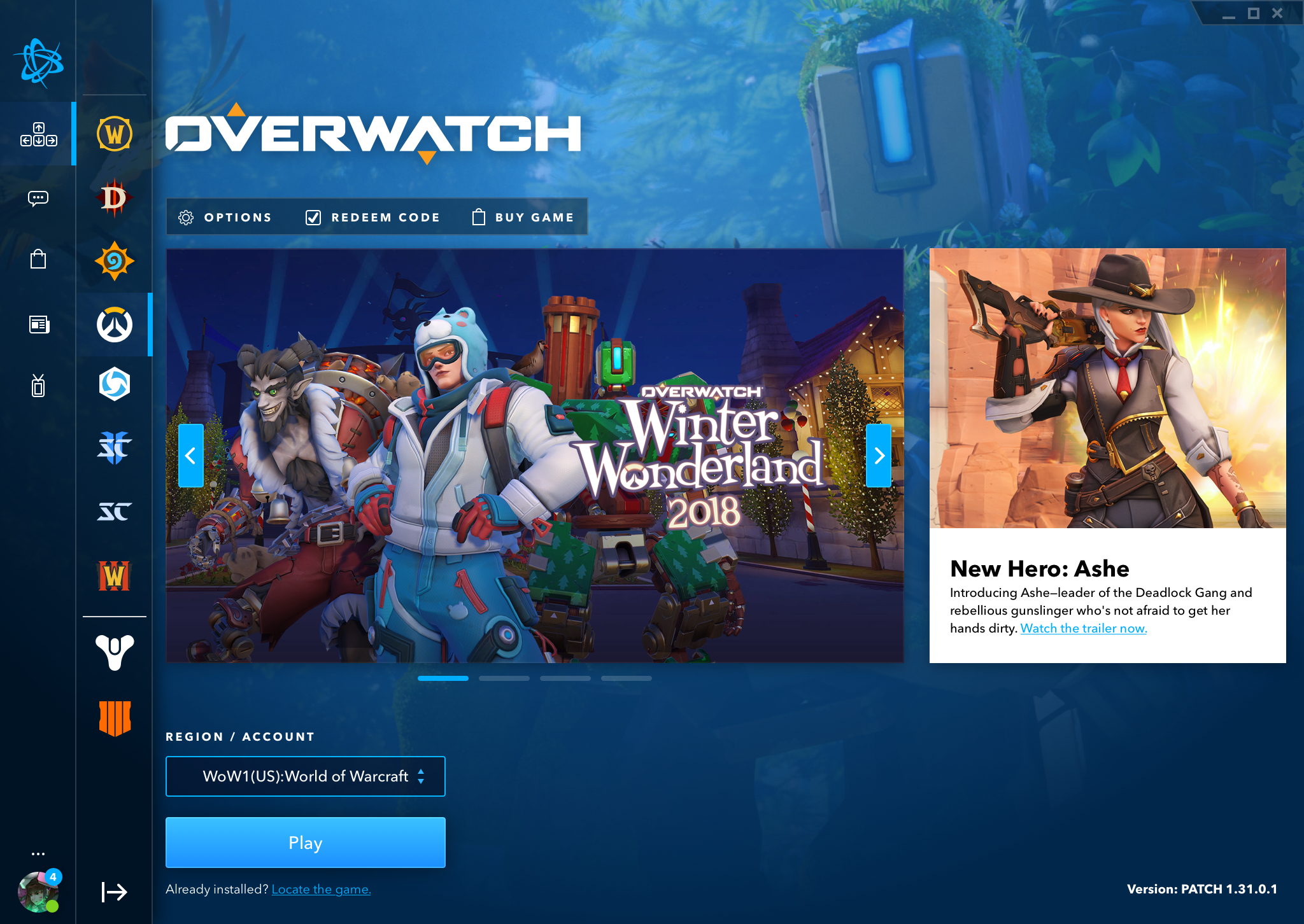
For the Battle.net Play Screen redesign, I took a look at the current iteration of Battle.net and began to analyze what elements need to be on the screen, while also looking at ways of optimizing screen space and legibility.
I aimed to utilize the space efficiently while also improving legibility by increasing the contrast between the background and modules. My initial thoughts were that the Play Screen could sometimes get too busy if the background image and the promotional modules clashed and didn’t have enough strong contrast.
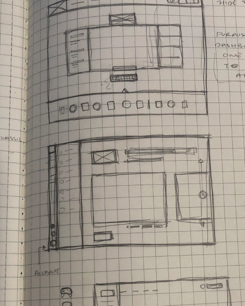
Sketching + Prototyping:
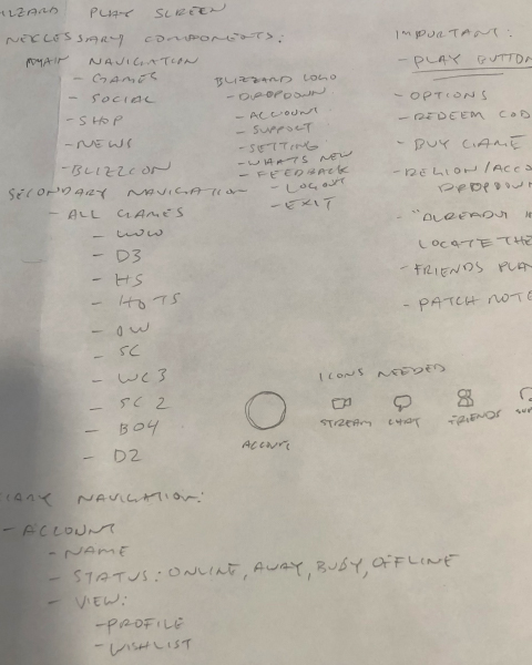
I began to sketch out my ideas after I took a hard look at what the most important components of Battle.net app were. Since this was a single page I was redesigning, I didn’t have to create a new user flow. Instead I followed the current flow and tried to improve the experience. I took detailed notes on primary, secondary, and tertiary navigation links that were important and their hierarchy in the experience.
Iteration:
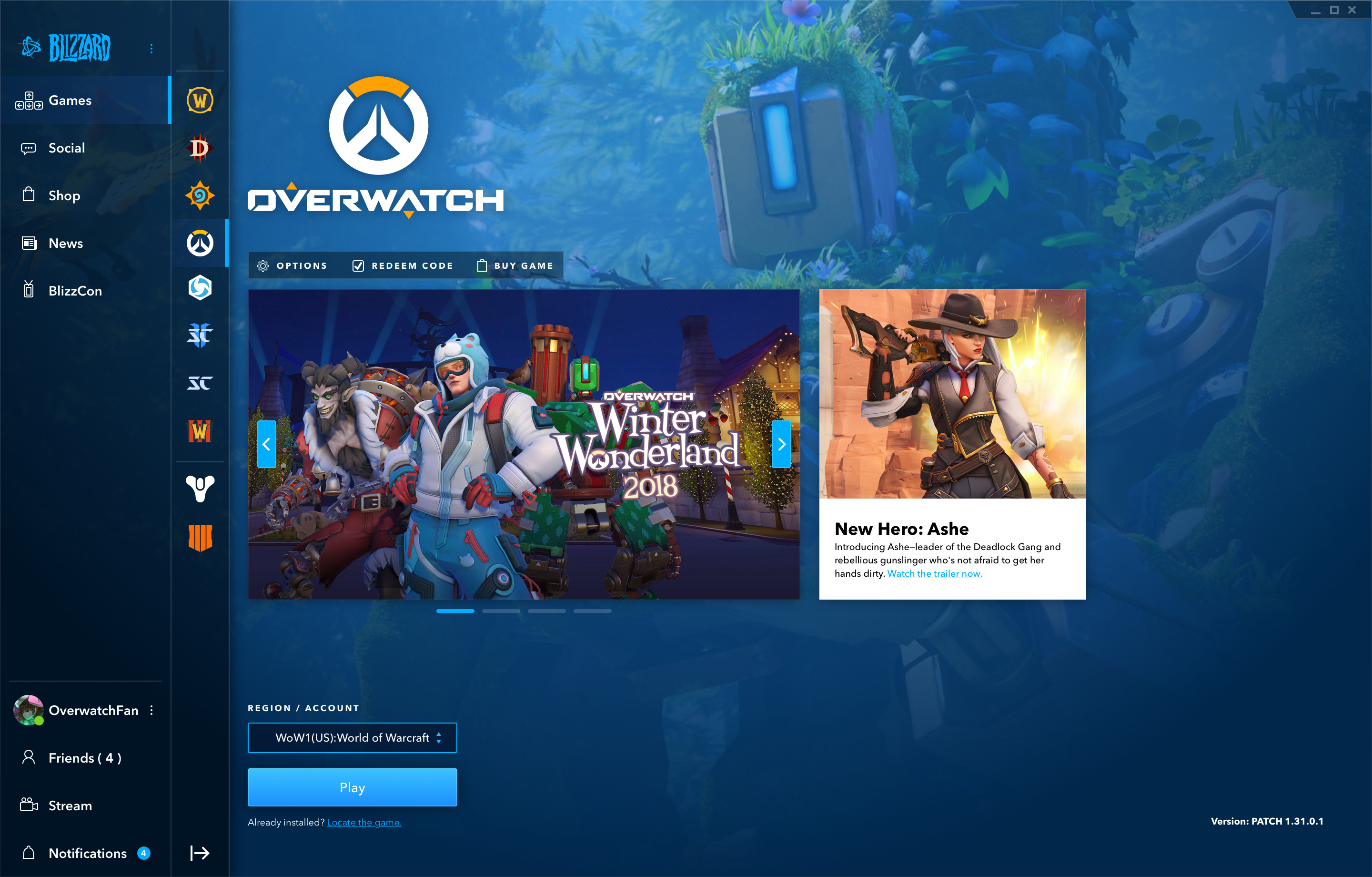
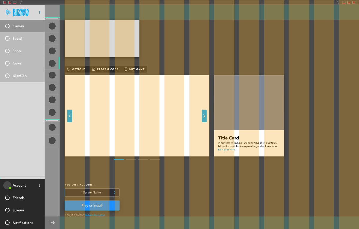
My thought process for moving the navigation to the side was that while the current
Battle.net design is highly functional, I felt that having both a top navigation and side
navigation on the Play screen made the experience feel tightly enclosed, especially for
smaller screen sizes.
I moved the main navigation to the side and also added icons to quickly distinguish between links. The icons also helped for smaller screen sizes by allowing the navigation titles to be hidden if the screen ever got too cramped. I also wanted to keep the functionality of being able to hide the titles of the different games because I thought it was already well designed and I feel the average Battle.net user knows Blizzard games well enough to differentiate between the different logos.
I moved the main navigation to the side and also added icons to quickly distinguish between links. The icons also helped for smaller screen sizes by allowing the navigation titles to be hidden if the screen ever got too cramped. I also wanted to keep the functionality of being able to hide the titles of the different games because I thought it was already well designed and I feel the average Battle.net user knows Blizzard games well enough to differentiate between the different logos.