2021-23
Vans Family
Visual Design / Illustration / Typography / Layout / Art Direction
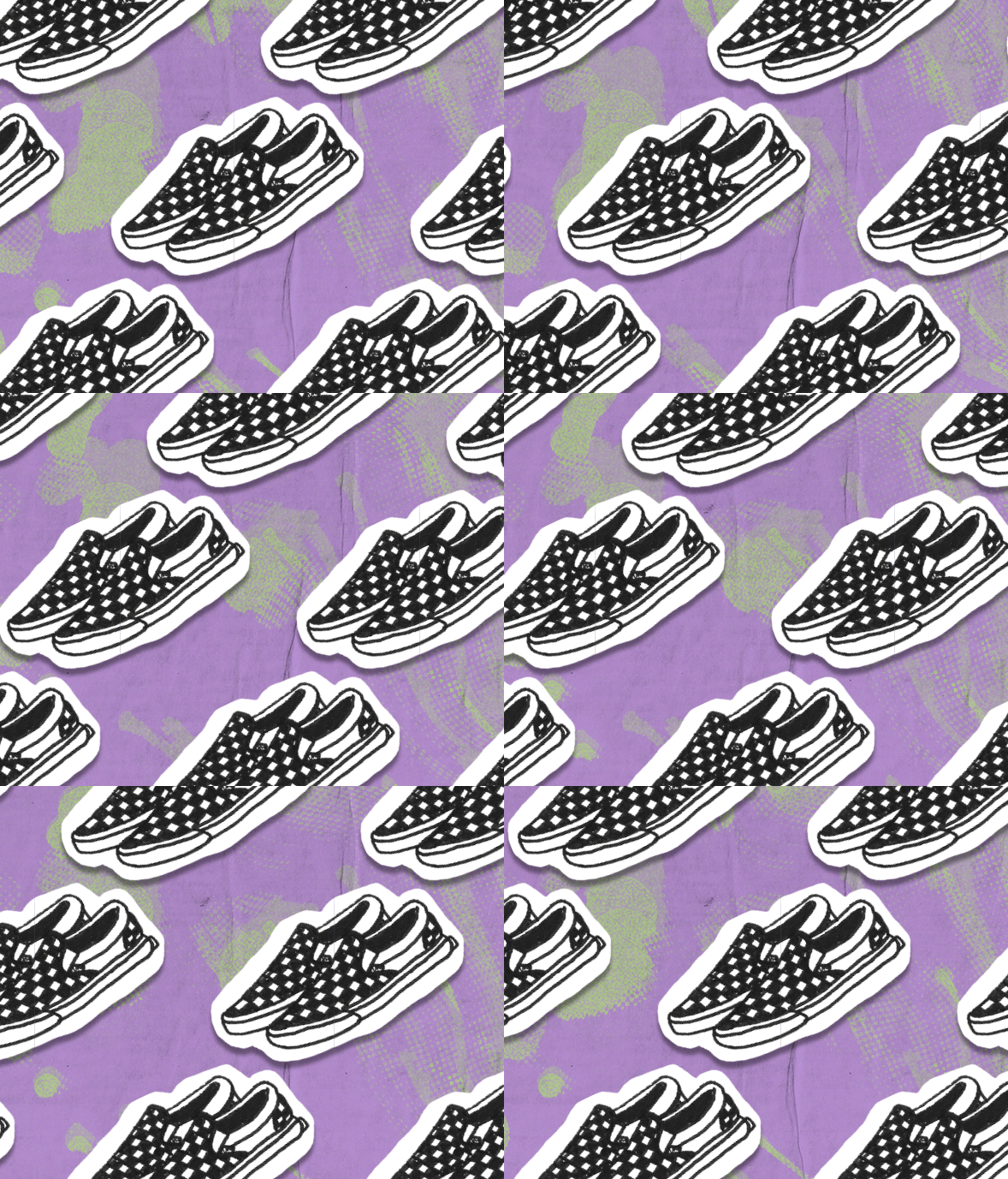
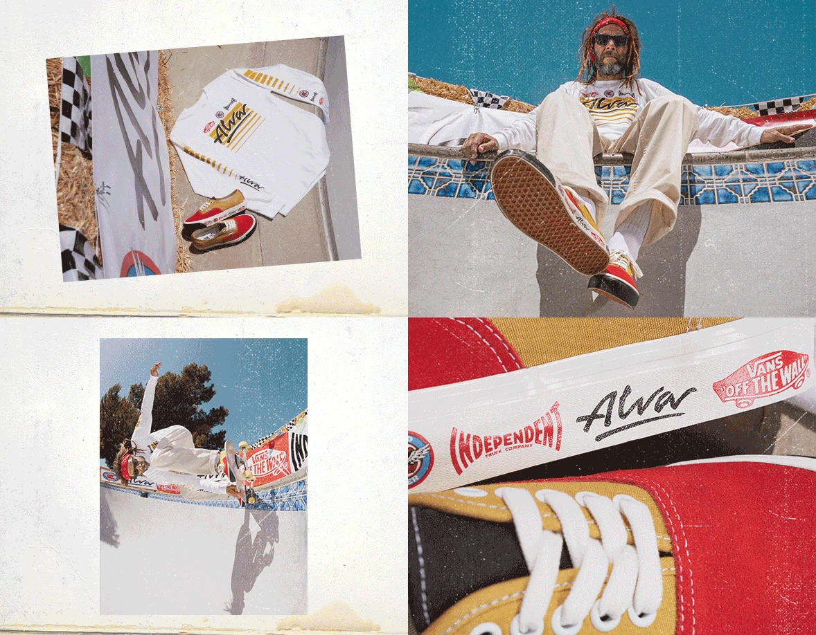
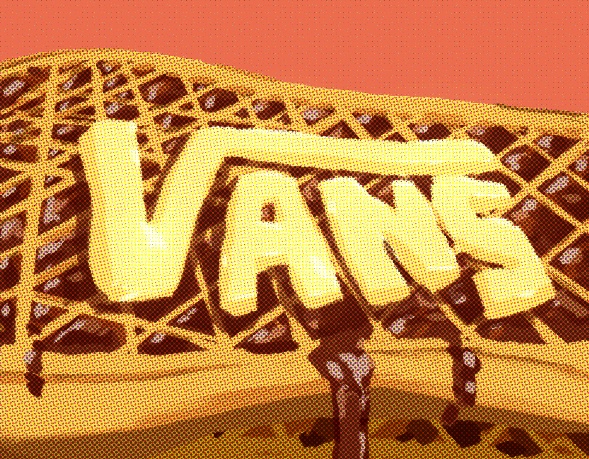
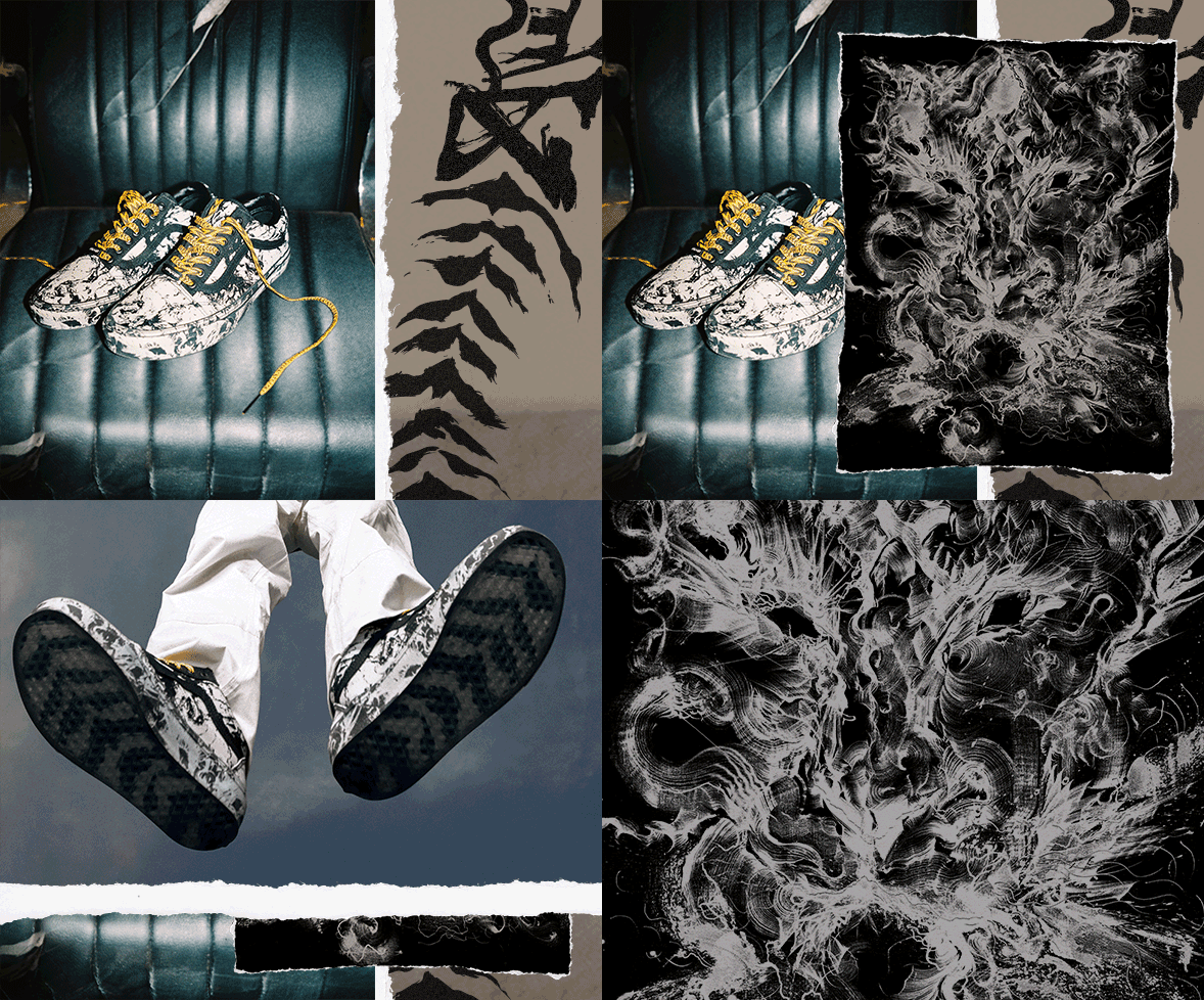
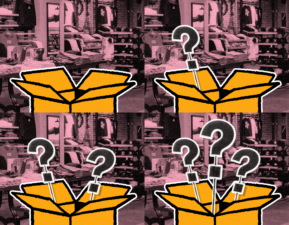
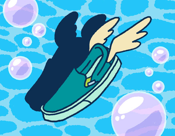
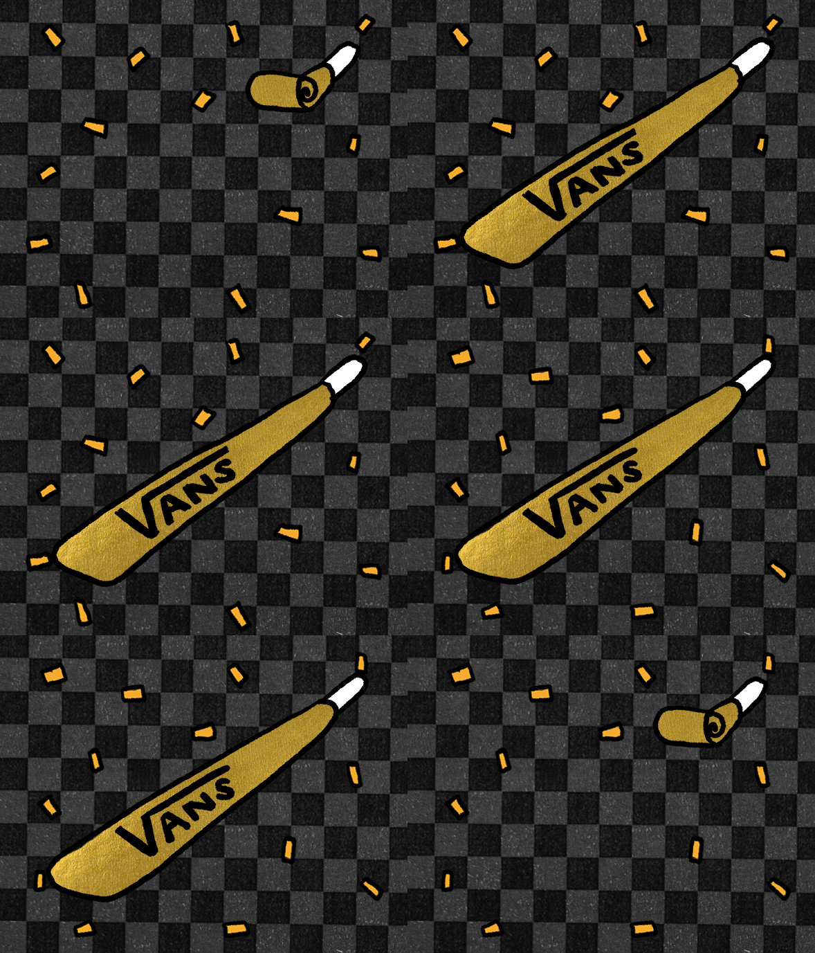
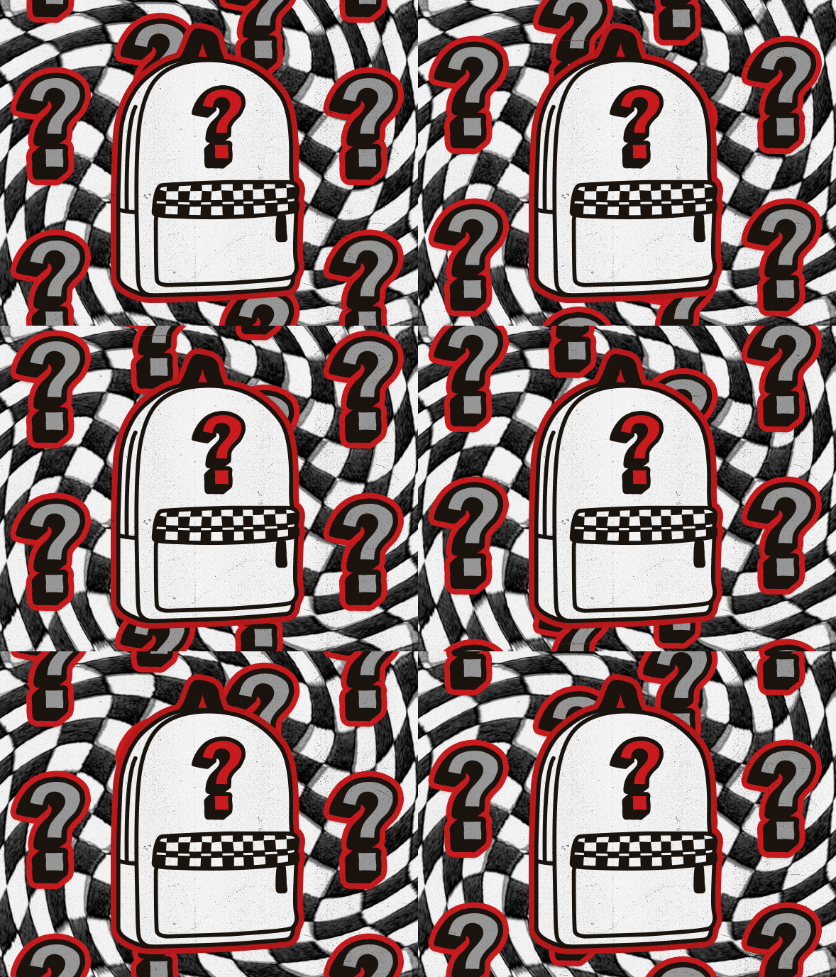
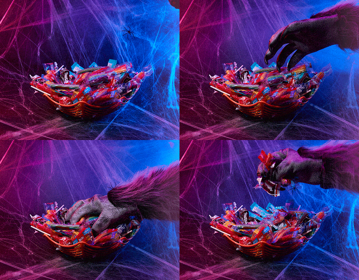
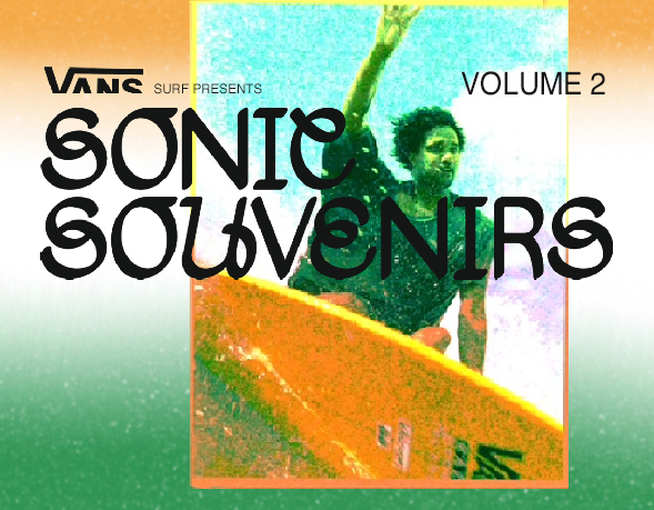
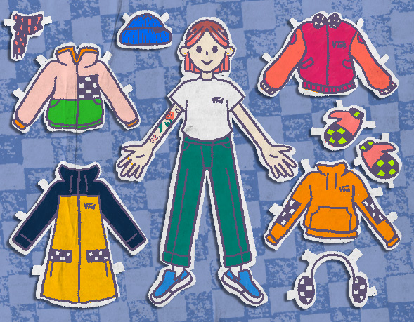
Got the opportunity to work for one of my favorite companies, Vans. I got to work with the in-house team to create a variety of graphics and designs for different events, promotions, and collaborations. Here are some of my favorite works produced.






2021
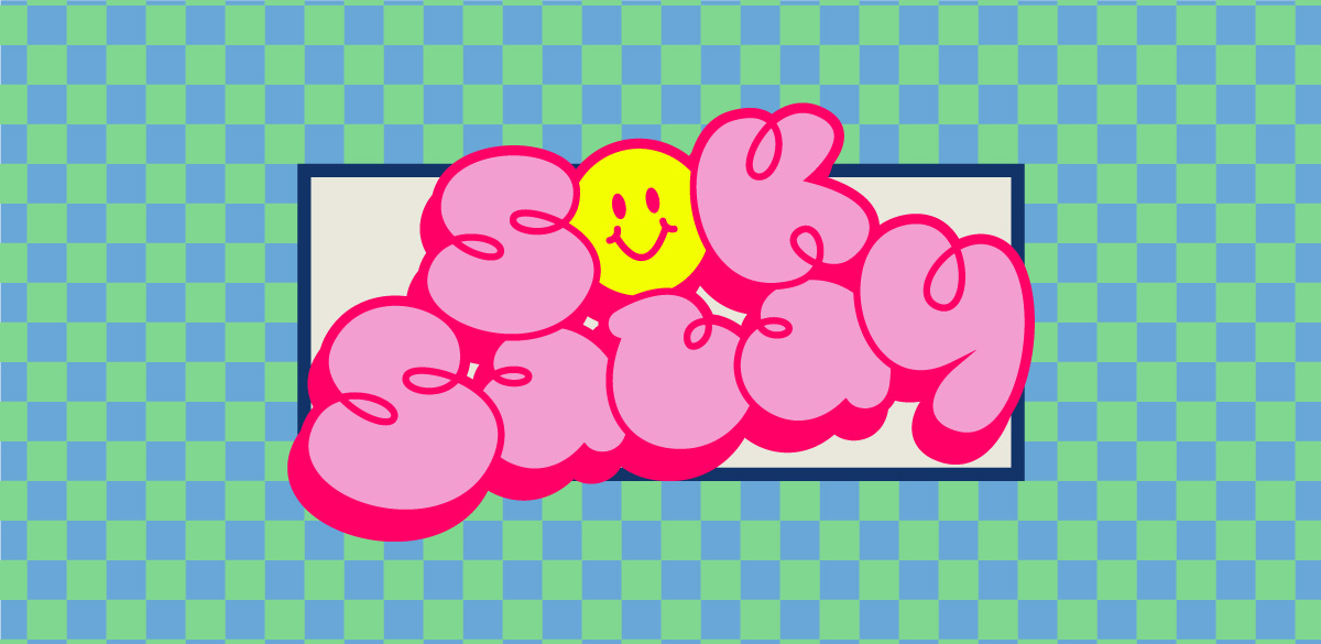
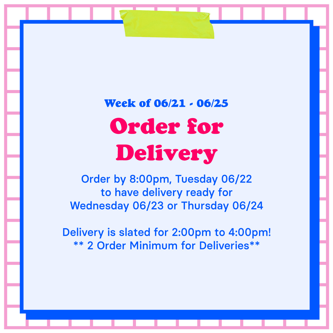
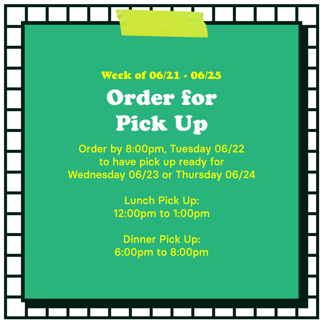
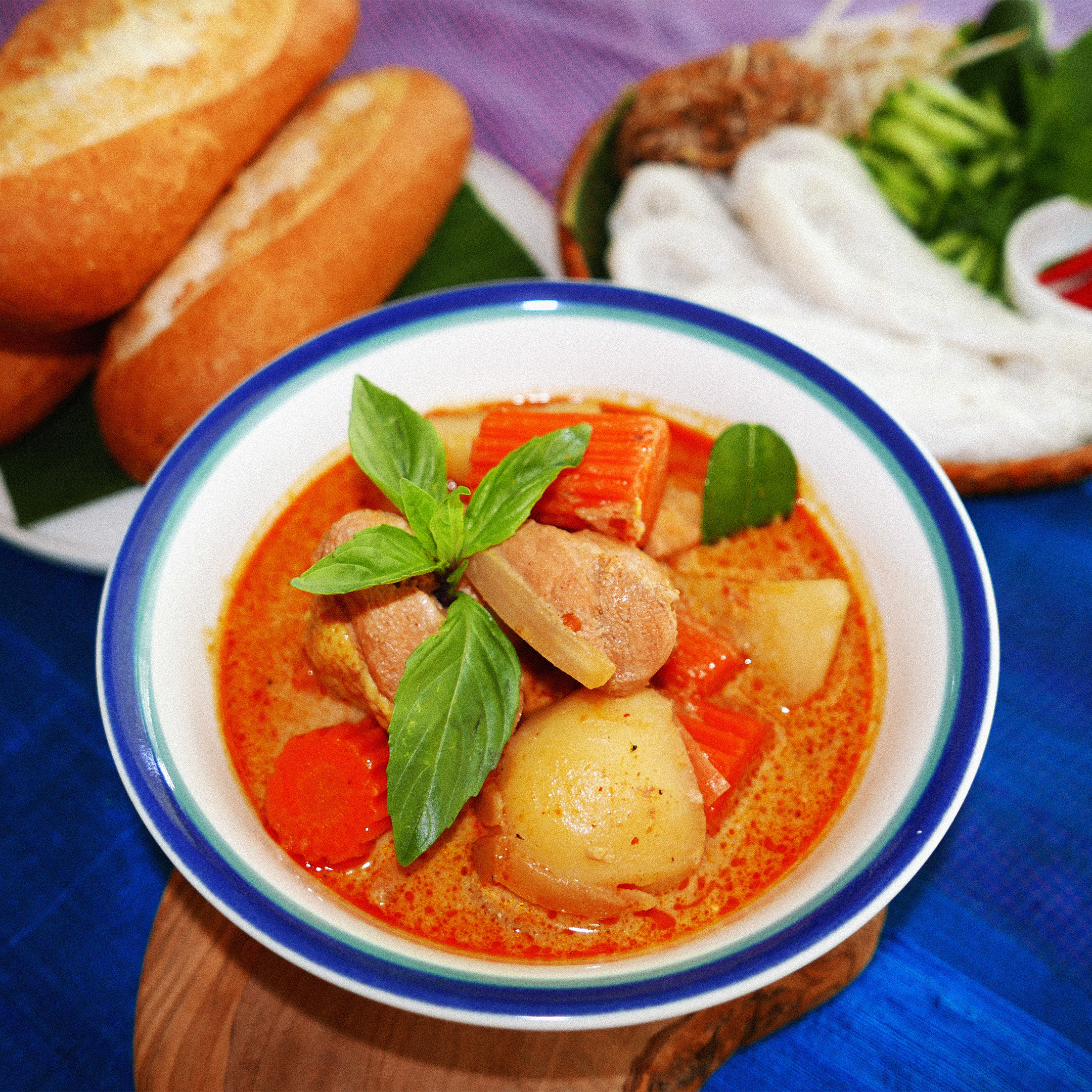
Sok Sabay Khmer Kitchen
Branding + Identity
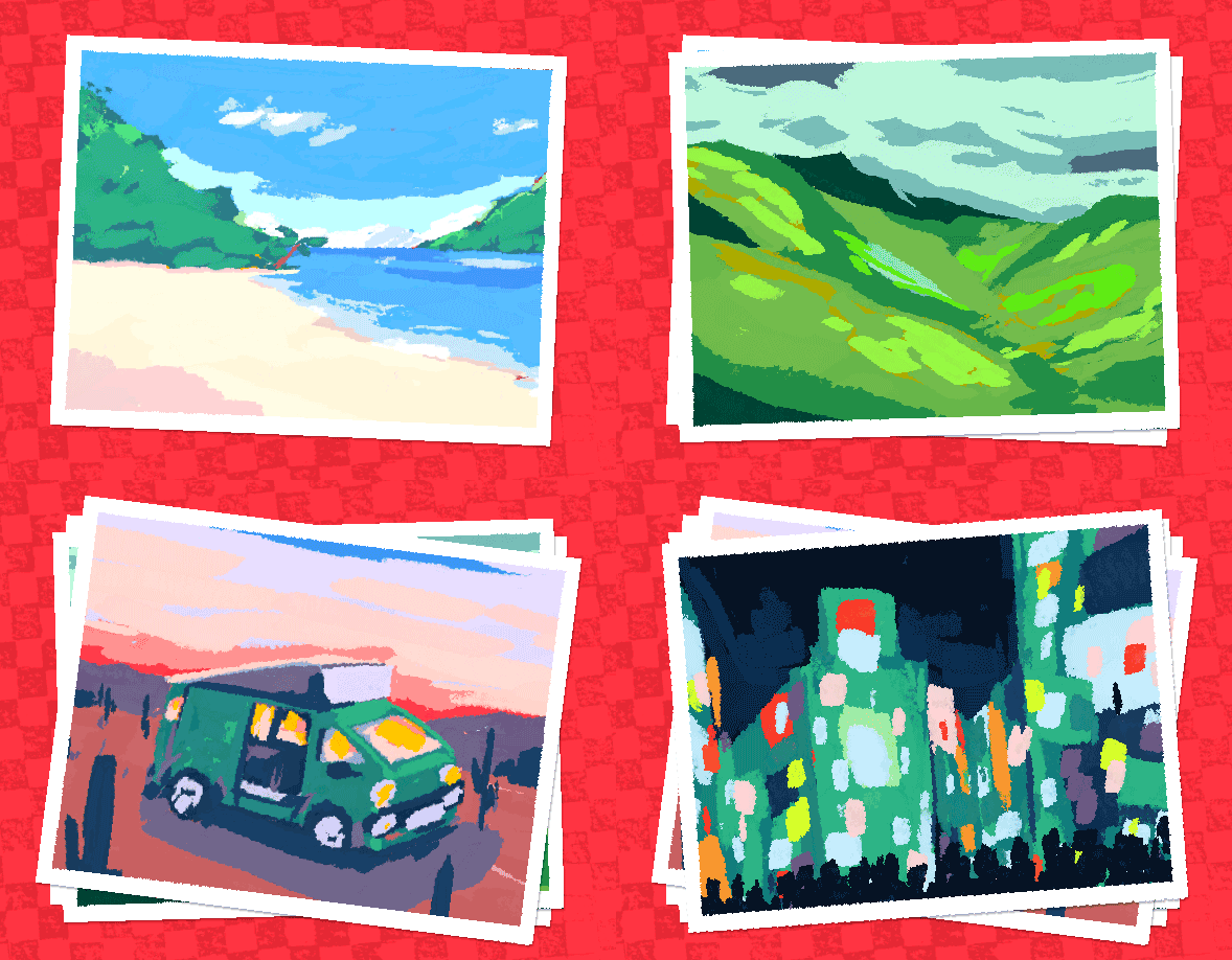
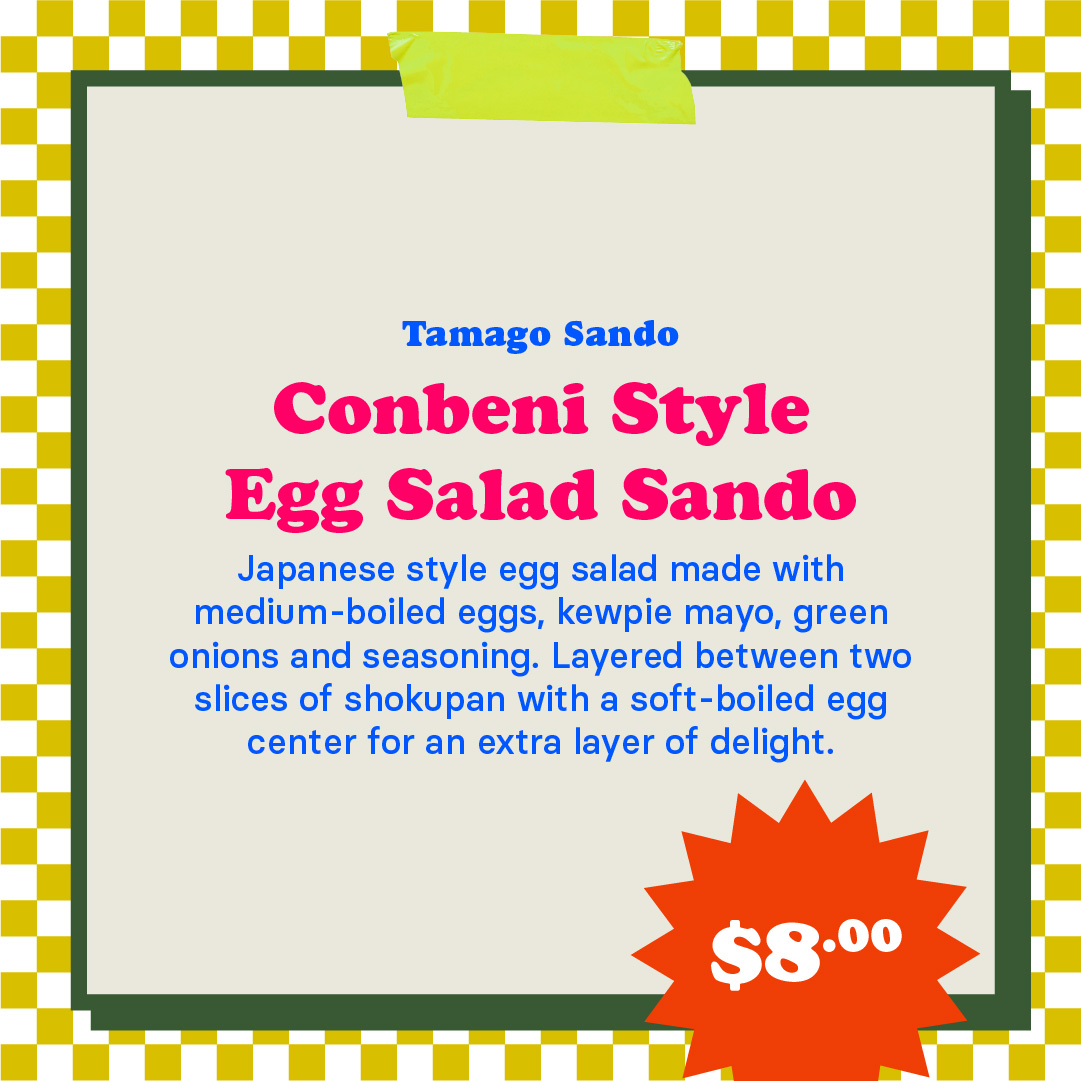
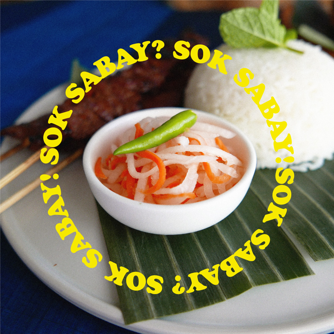
Sok Sabay is a common greeting between Khmer people. Literally, it means peace and happiness but as a greeting, it is a way to ask how you are doing. In turn, you can reply with Sok Sabay to let others know you are well.
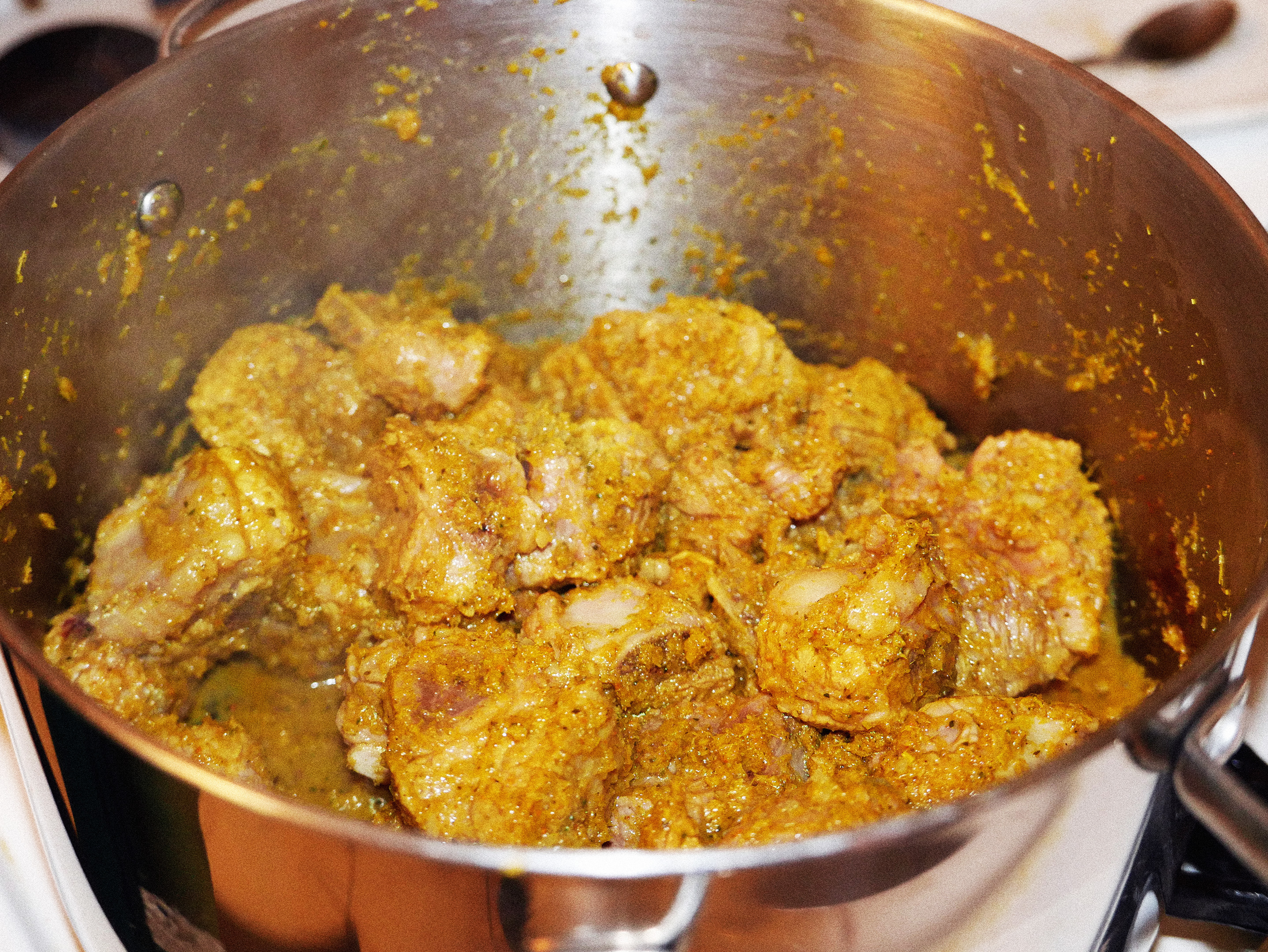
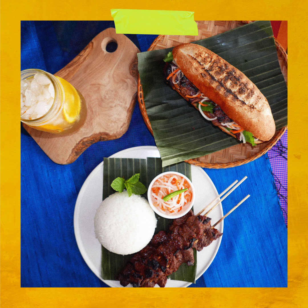
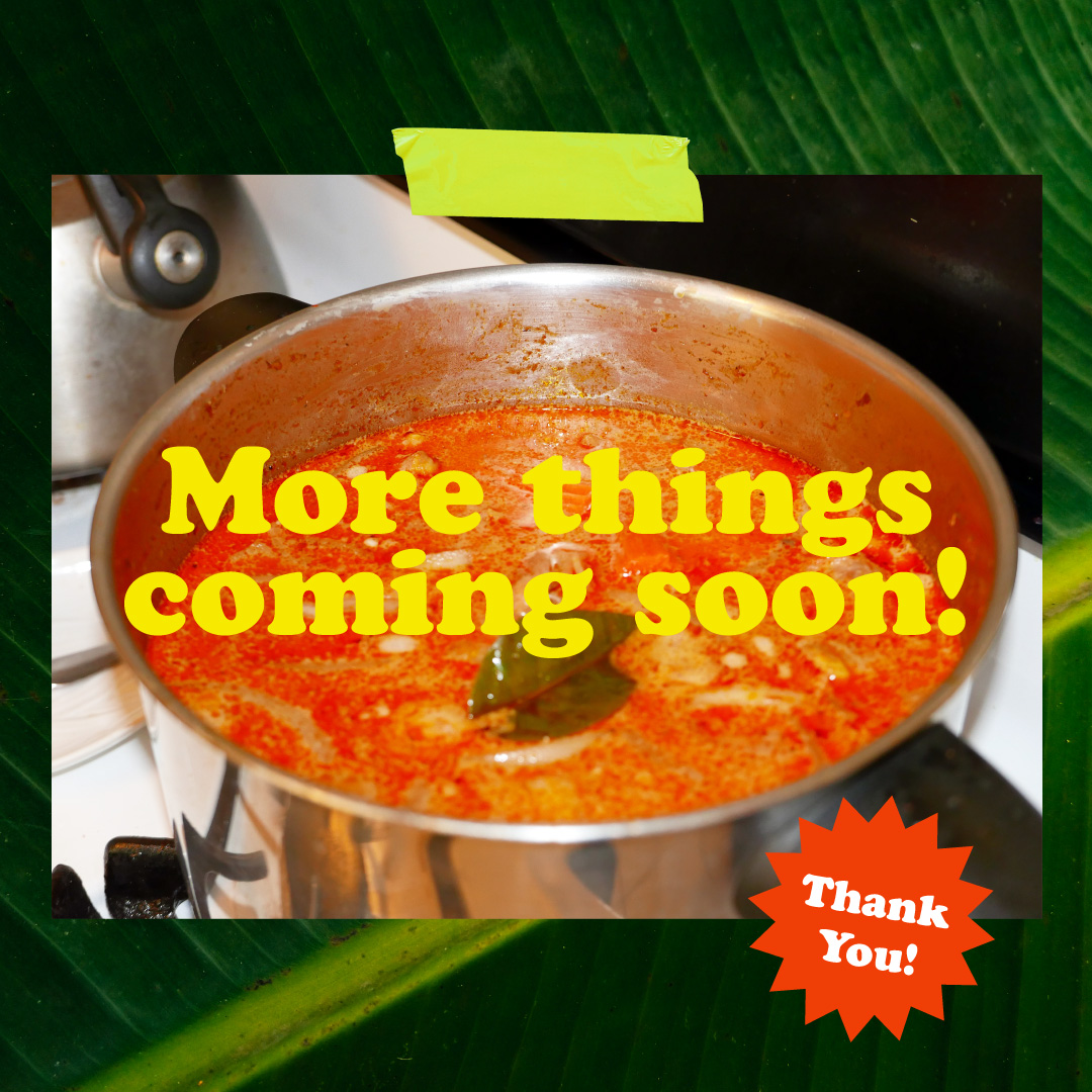
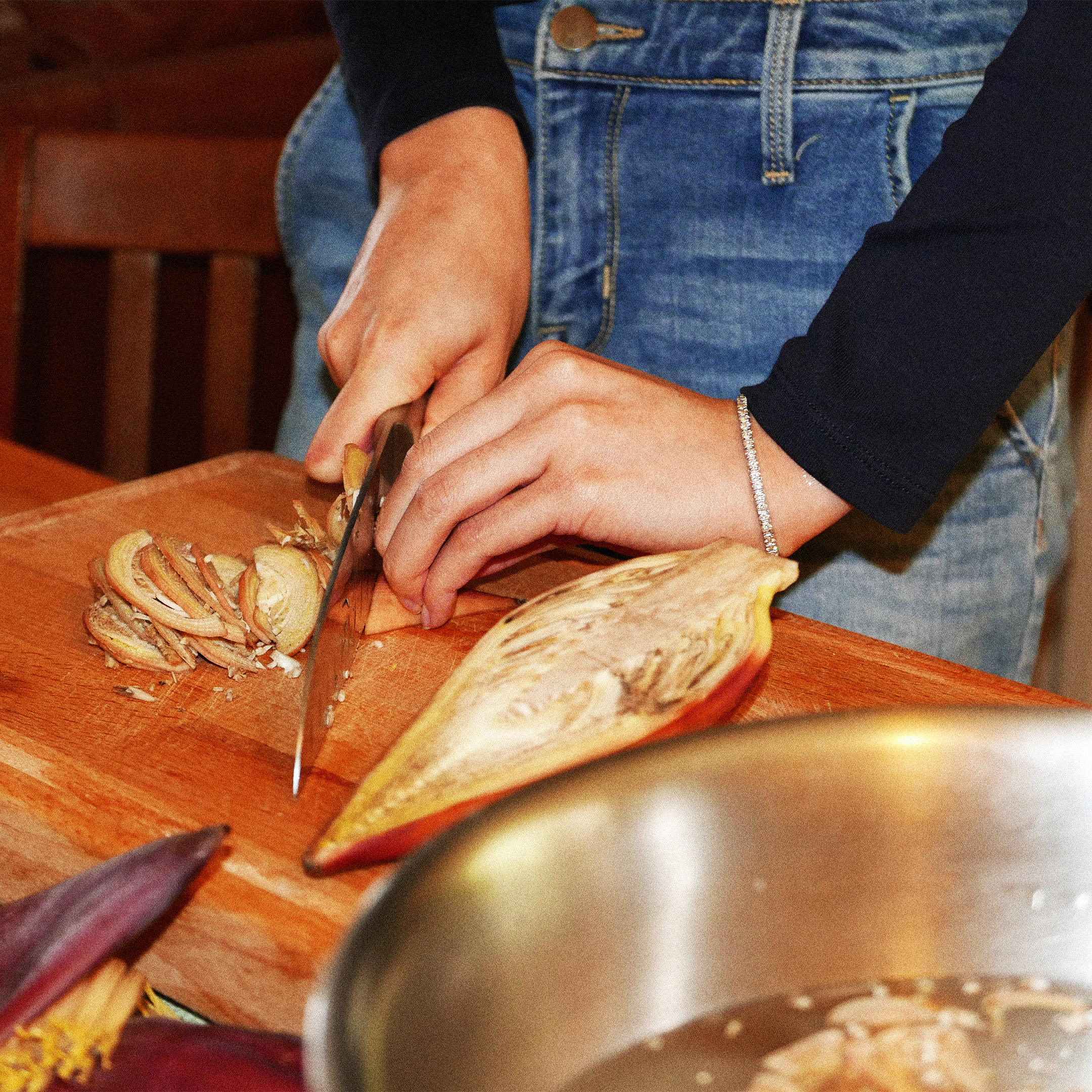
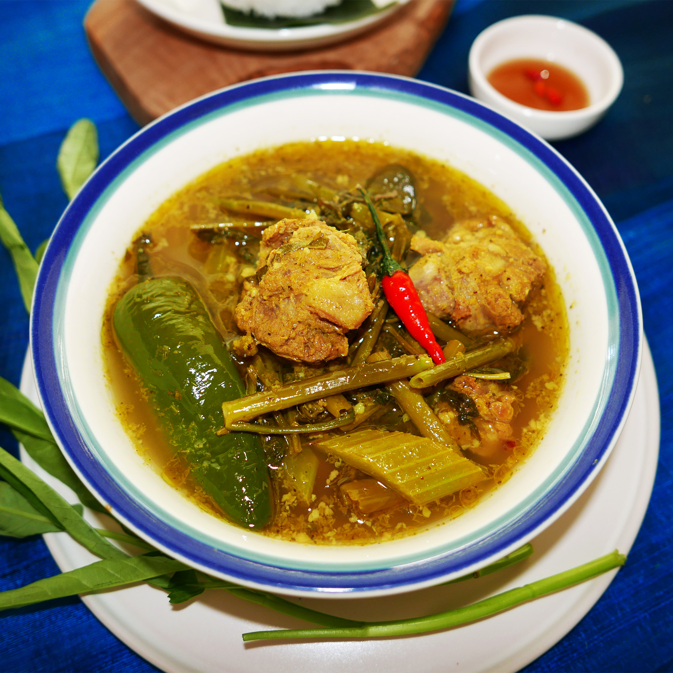
I started this project as a way to share Cambodian food with my friends so that they could get a little taste of my culture and also because I love to make food for people. Cooking during the pandemic has been very therapeutic for me and has easily become one of my favorite pastimes.
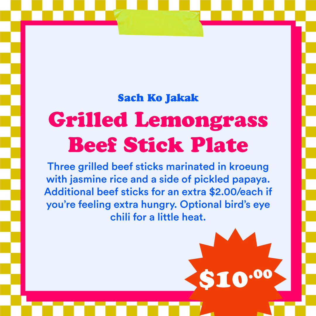
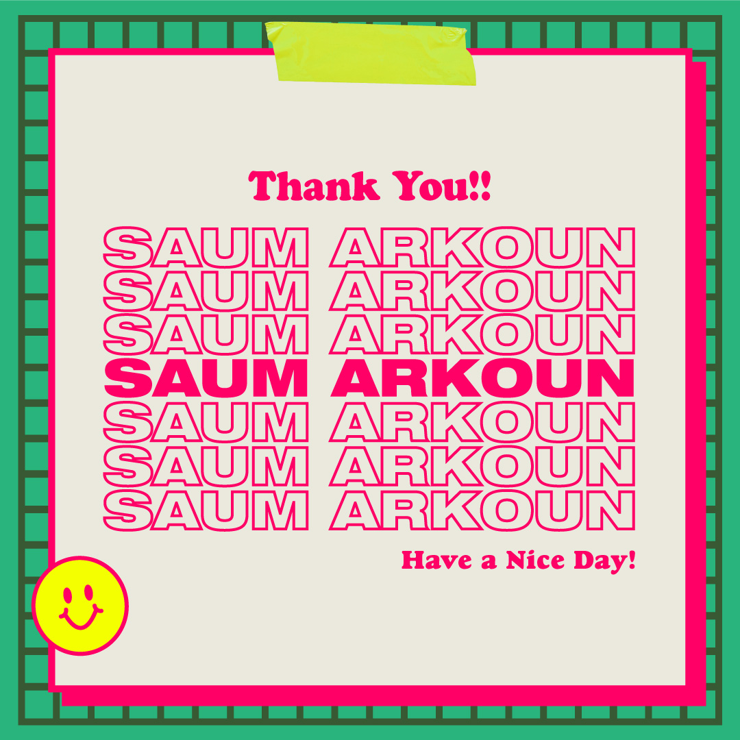
The core influence for the branding is my background as a First Generation Cambodian American. I use typical American diner aesthetics but fuse vibrant colors reminiscent of traditional Khmer textiles. Cambodian people have a rich history with color and I wanted to incorporate the vibrant textile work that reminds me of Cambodia.
This is an on-going project that I hope to keep working on and continuously improve upon.
︎ Sok Sabay




2020
White Cell DIY Blank Sculptures
Logo Design
Plastic Cell is a group of brothers making amazing hand-sculpted and hand-painted figurines. I was asked to help brand their line of blank figurines called White Cells.
Plastic Cell is heavily influenced by science fiction and the future and I wanted to incorporate that influence into the design of the logo. A lot of modern logos today are very minimalist and simple in their approach but I wanted to go against that and try to create something more memorable for the brand.
Social:
︎ Plastic Cell
︎ White Cell


2021
Food Capsule
Logo Design
Food Capsule is a collection of amazing food, recipes, art, and pretty much anything having to do with food.
For this logo, I really felt the name had a Y2K vibe and pushed the design in that direction. I incorporated spirals and stars to invoke feelings of infinite vastness.
The logo was also made with versatility in mind, allowing the system to be catered to whatever content is being showcased. There is a secondary logo for the blog’s music showcase titled ”Songs to Cook To”, with more variations in the works.
Social:
︎ Food Capsule


2021
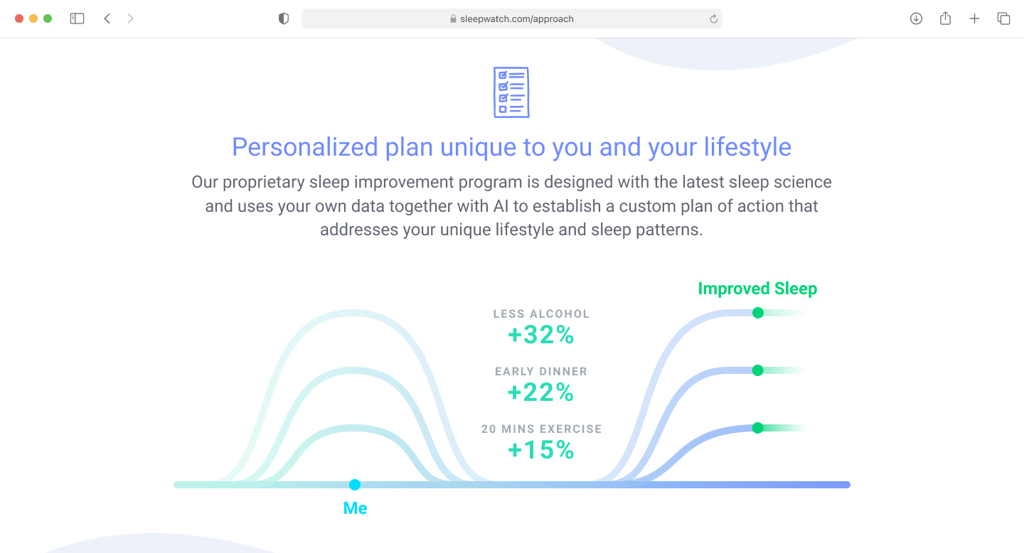
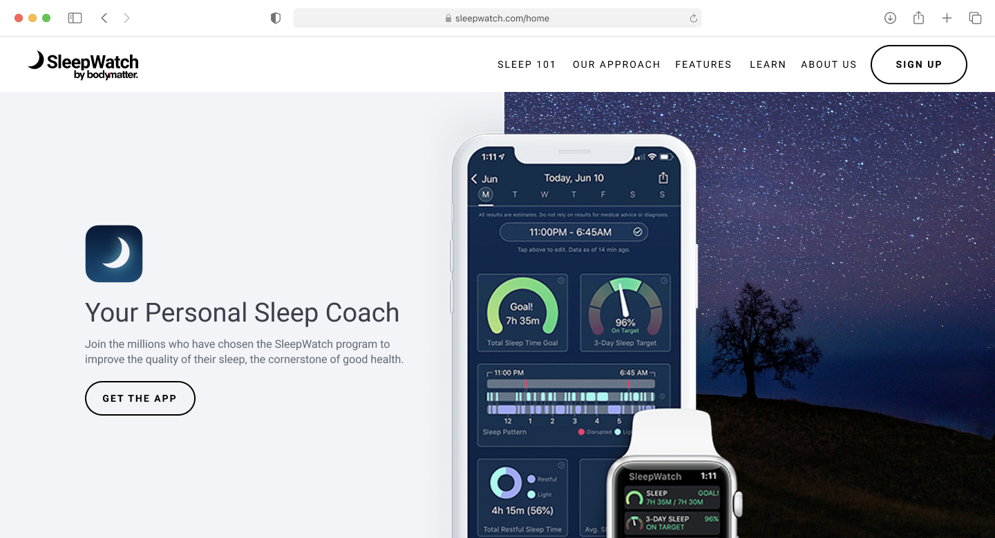
SleepWatch Website
Web Design
Some redesign work done for SleepWatch. Since I helped with the creation of their web brand guide, I was also asked to helped with the branding and identity of their online presence. Although it is a work-in-progress, here are some pages I thought turned out well.
