2019
Download Page Redesign Exercise
UX + UI / Visual Design

For this redesign project, I wanted to take a step back and
see what could be improved on both the Download page
and the Battle.net Play screen. I began by analyzing both
experiences and taking notes on what I thought could be
improved upon or changed. Without user data, I had to
instead make assumptions and gather competitive analysis
on ways to improve the experience for the user and see
what competitors have done successfully.
Assumptions:
Assumptions:
- Since Battle.net is the main hub for clients, it should be featured on the Download page
- Most people know what client they are looking
- The redesign would need to be future proof to be able to continue to add new content
- Try to keep the user flow on the page short and to the point
- Add branding to differentiate each game client easier for the user
Main Goals:
-
Reorganize the Download page for a smoother experience
- Unify the look and feel
- Provide some branding for new users who do not know what each game entails
4. Create and modern look and experience
- Advertise the Battle.net app for new users
Requirements:
-
Every client must be easily accessible
- Distinguish between different platforms (desktop games vs mobile games)
- Provide a way to filter through the growing list of game clients
Research + Analysis
After reviewing the majority of the main Blizzard site, I could tell that the Download page has not been updated in quite some time. I also noticed how the page was very utilitarian and was very much Function over Form.
Since I didn’t have any user feedback other than my own, I had to do a little bit of competitive analysis and take a look at what other competitors are doing with their download pages.
My main assumptions for the Download page were to include a bigger section above the fold to point users towards Battle.net and the redesign would need more branding to be in line with current Blizzard trends.
Sketching + Prototyping:
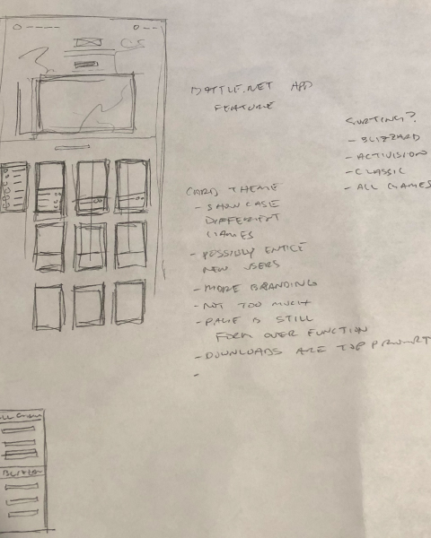
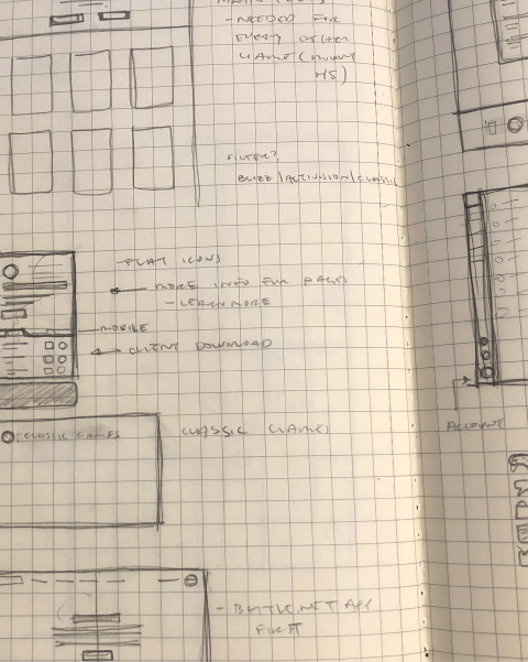
I began to sketch out my ideas after I took a hard look at what the most important components of the Download page and Battle.net app were. Since this was a single page I was redesigning, I didn’t have to create a new user flow. Instead I followed the current flow and tried to improve the experience. I took detailed notes on primary, secondary, and tertiary navigation links that were important and their hierarchy in the experience.
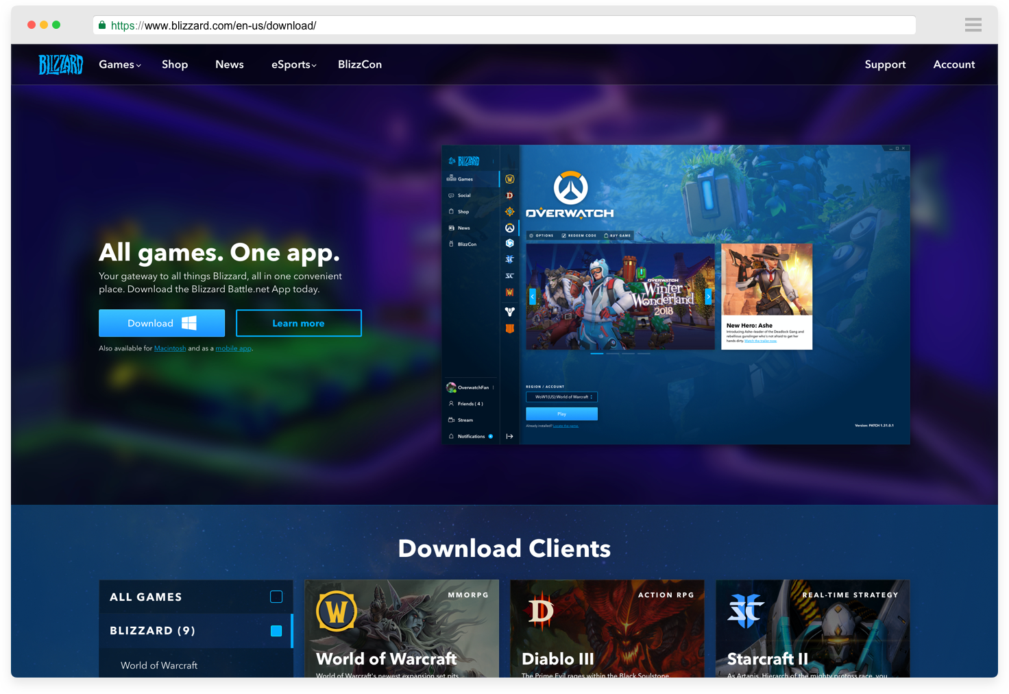
After mapping and sketching my ideas on paper, I created a grid system and then began to prototype the wireframes. I based my grid on 12 column grid since it is the easiest to work with and dynamic enough for flexibility.
Iteration:
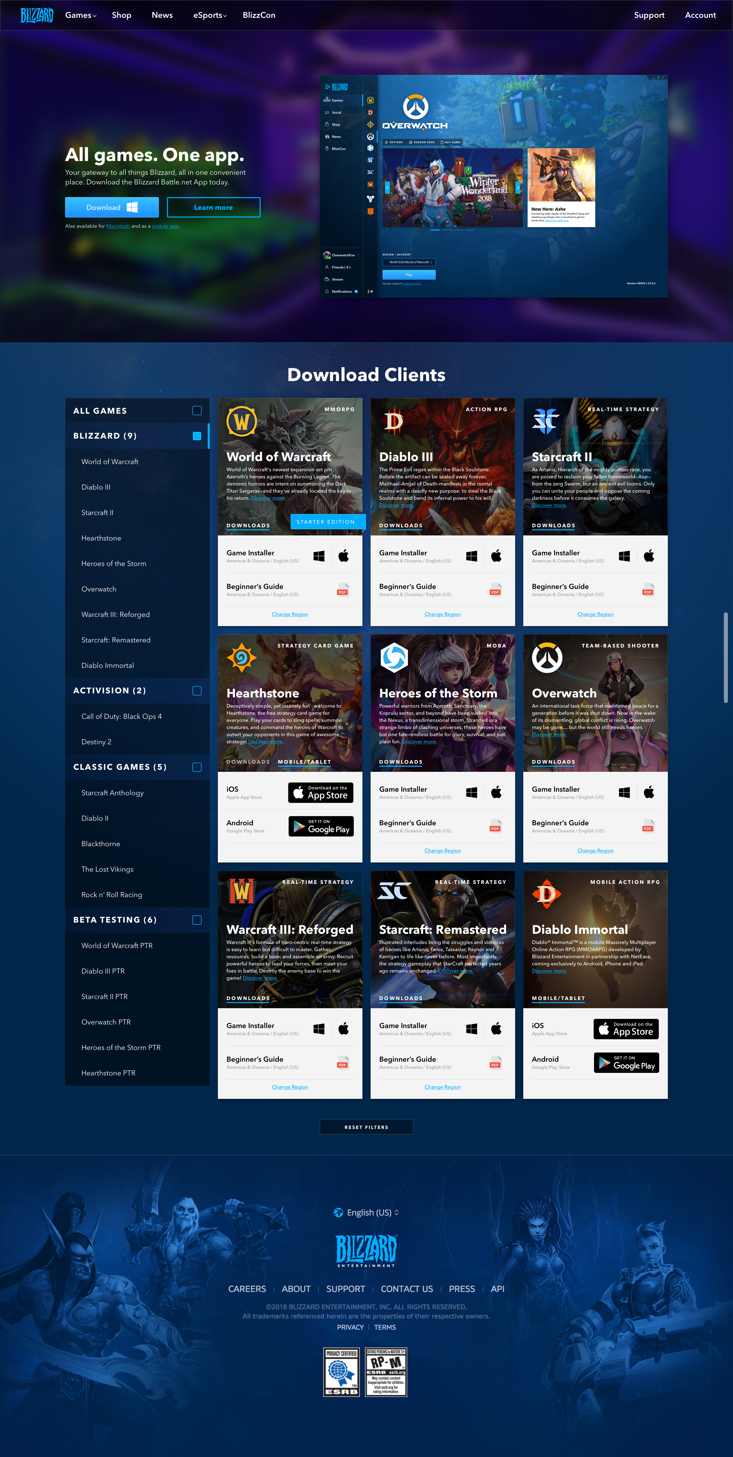
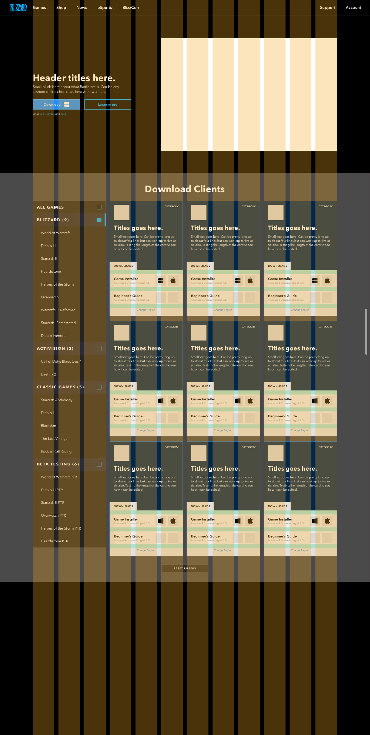
For the Download page, I utilized the main header of the page to try and push the Battle.net app since it is the main hub to download all game clients. I felt this was a needed addition to the page and also provided both a download link to the Battle.net app and also a redirect to the Battle.net page to learn more about the application.
For the main bulk of the download page experience, I designed a card system that would easily be able to be expanded upon. I wanted to create a system that was future-proof in case there were ever a need to add new games to the page.
By using this card system, I also was able to include more branding for each game. New users could become more interested in other games if they get a sneak peak of what the other games entail. I also provided redirects to learn even more and to hopefully drive new users towards different games.
Lastly, I kept the footer as the standard Blizzard footer to keep it in sync with the rest of the site.