2016
Detail Page + Bundling System
UX / UI + Visual Design
Project Goals:
- Create a bundling system to promote cross sales.
- Utilize small space to share detailed information about bundled items.
- Create similar experiences for desktop and mobile.
Optional Objectives:
- Make quality of life changes to the product details page design.
- Promote social media sharing.
Along with adding a bundling system, we also took the time to make small quality of life improvements to the product detail pages. Majors changes included:
- An improved image carousel.
- Having the image carousel be fixed to the container so the renders are always in view when scrolling through options.
- Improving the color picker.
- Adding ways to share via social.
- A quantity updater.
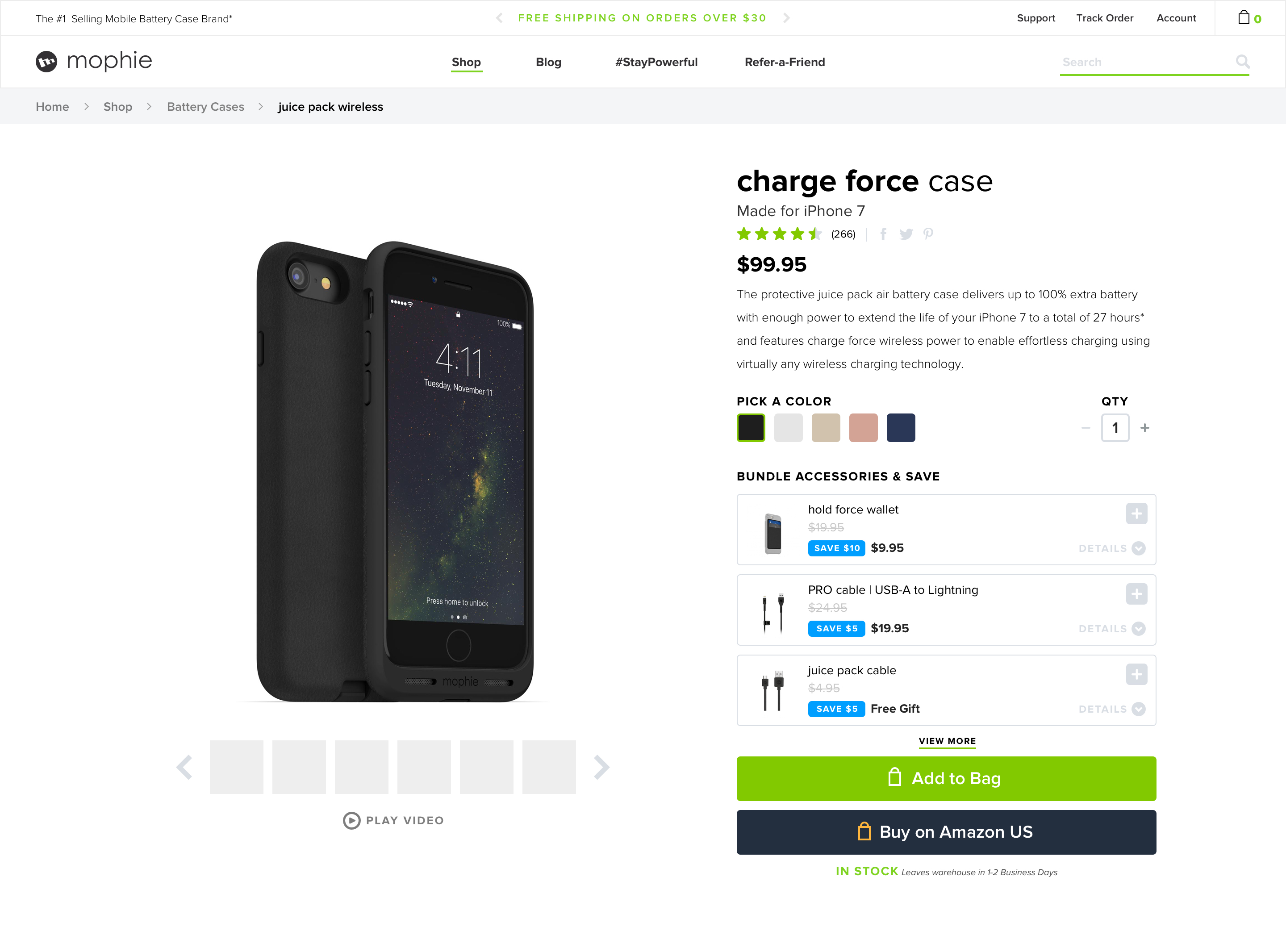

The bundle system was a pretty large project with a lot of small pieces. The goal was to create a better system to make combo purchases. I came up with this system to provide more options for the user to get everything they need in one go.
Some of the requirements made utilizing the space efficiently very important. We needed to include:
Some of the requirements made utilizing the space efficiently very important. We needed to include:
- A badge showing how much the user saves by bundling
- Including a system for different options a product might have. (The previous bundle system only defaulted to the main product choice with no other options.)
- Include tool-tips so the user could get a quick glance at what the product does.

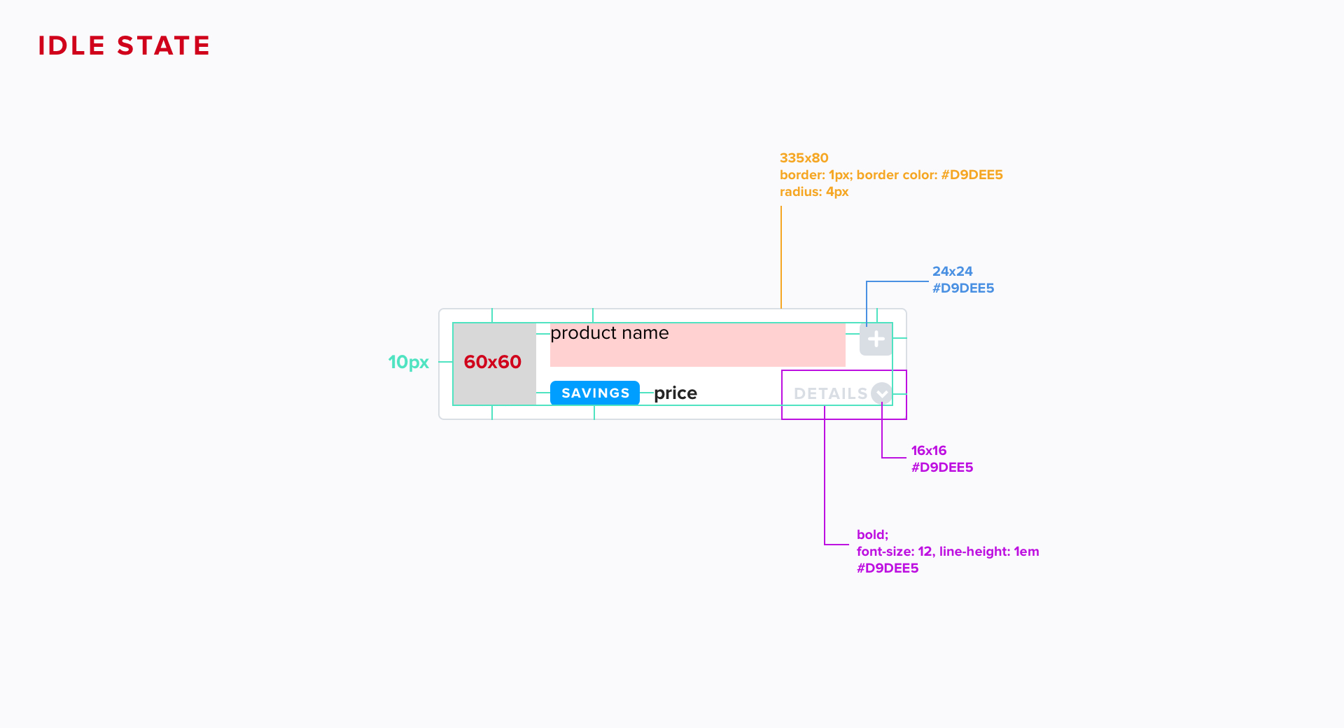
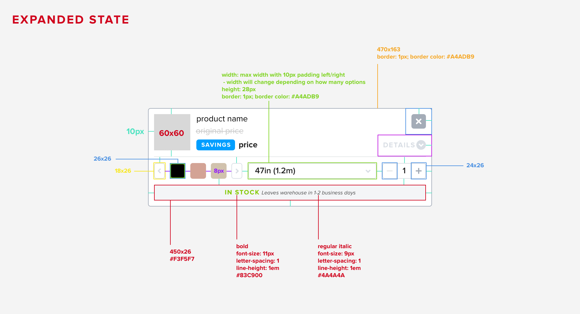

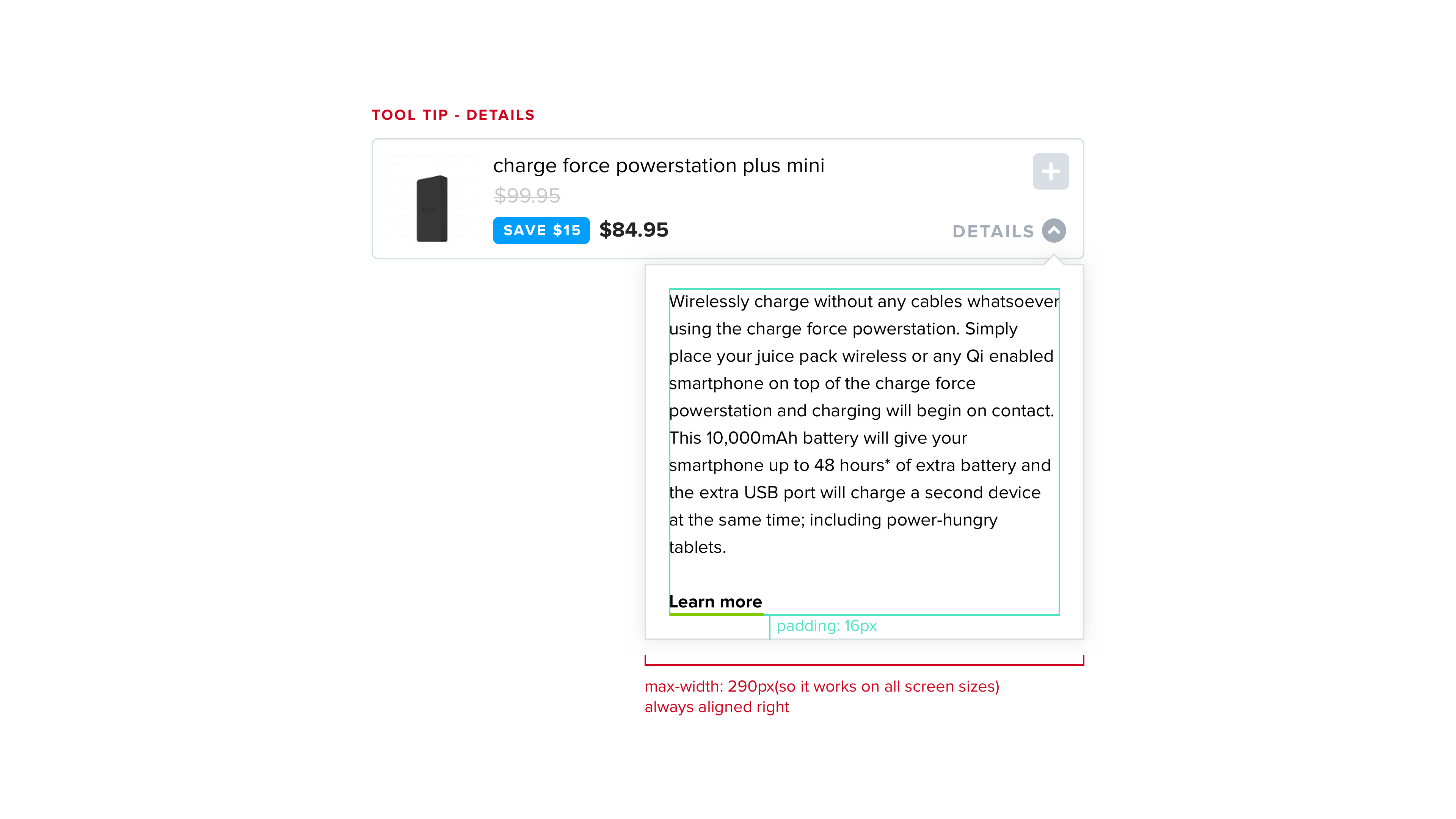
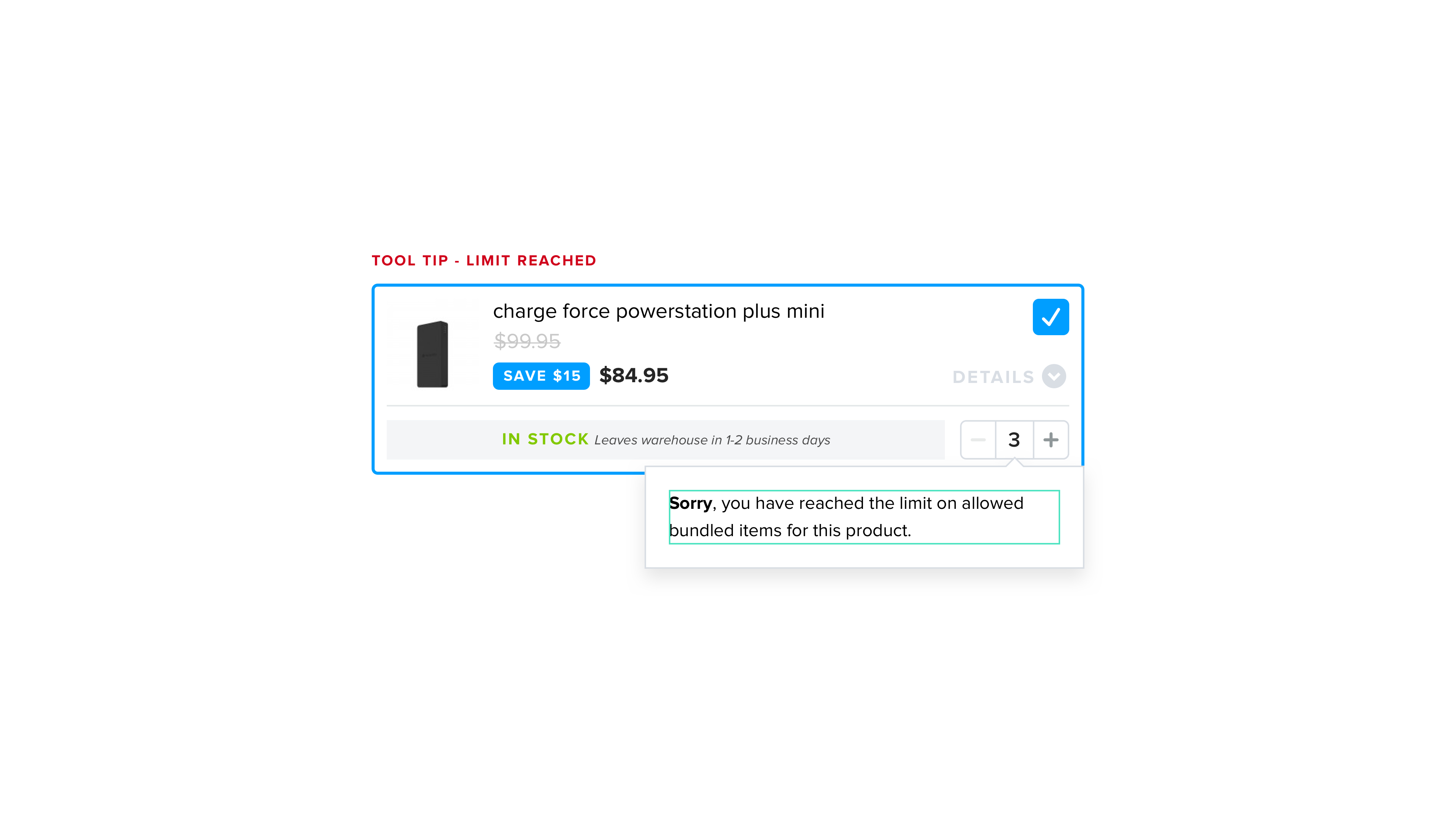
The bundle system was really restricted to mobile in many instances. When I began designing the little details, I worked on the mobile and desktop versions simultaneously to make sure it was fully responsive. I had to double check small things like making sure there was enough text space for long product titles, including the different options of products, and including the stock status.
Once the experience worked on mobile, it became a lot easier to manage the desktop version. They include the exact same information but of course there was more space to work with on desktop.
Once the experience worked on mobile, it became a lot easier to manage the desktop version. They include the exact same information but of course there was more space to work with on desktop.
