2017
Navigation System
UX / UI + Visual Design
Project Goals:
- Create an experience that is quick and efficient for users to find what they need.
- Create a system to organize links into categories that make it easier for users to navigate.
- Be flexible enough to future-proof the design for updates and new links.
Optional Objectives:
- Utilize extra space for up-sells when and where it makes sense.
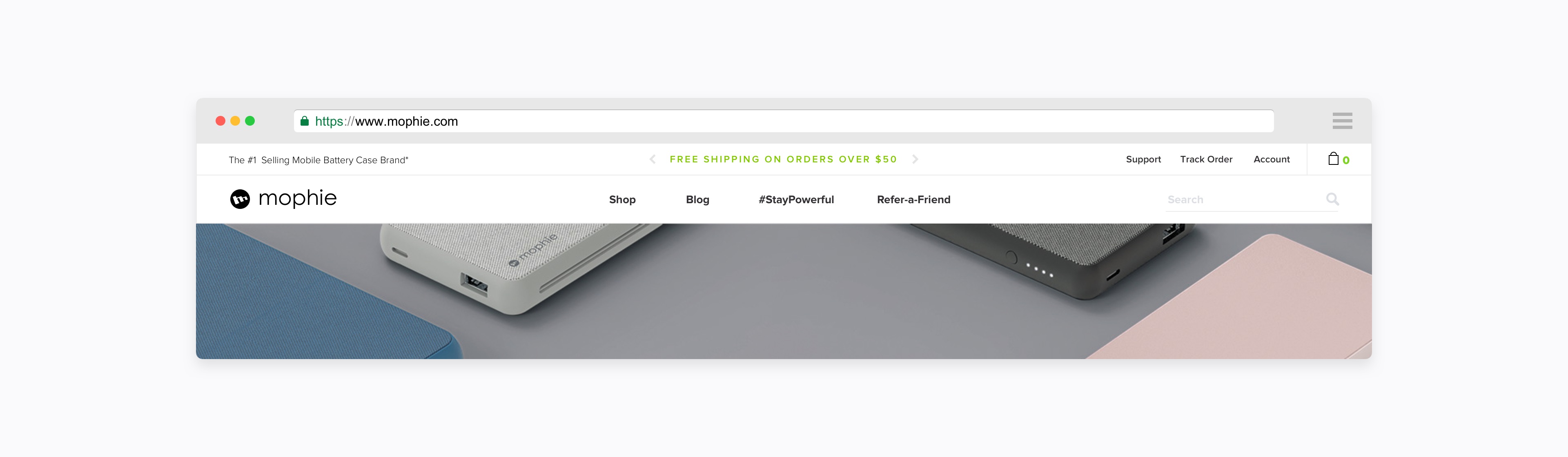
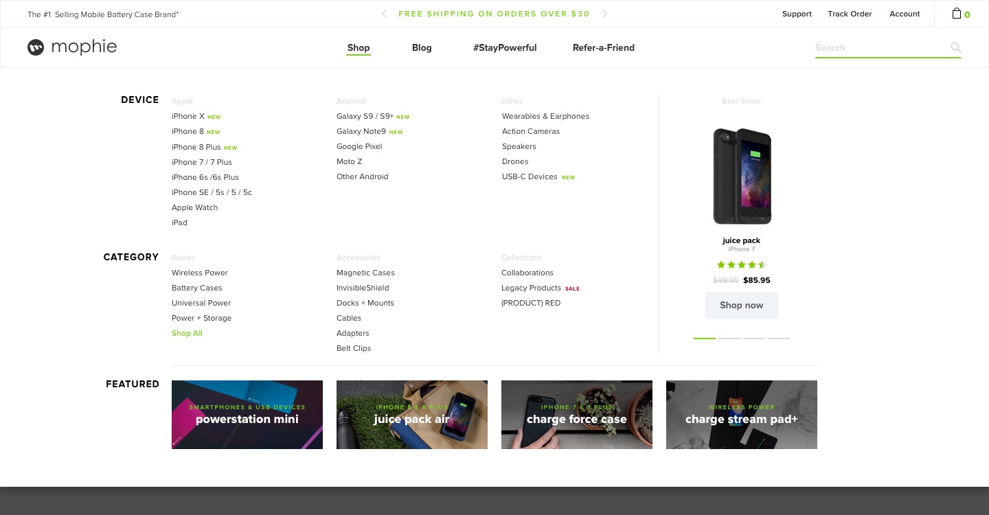
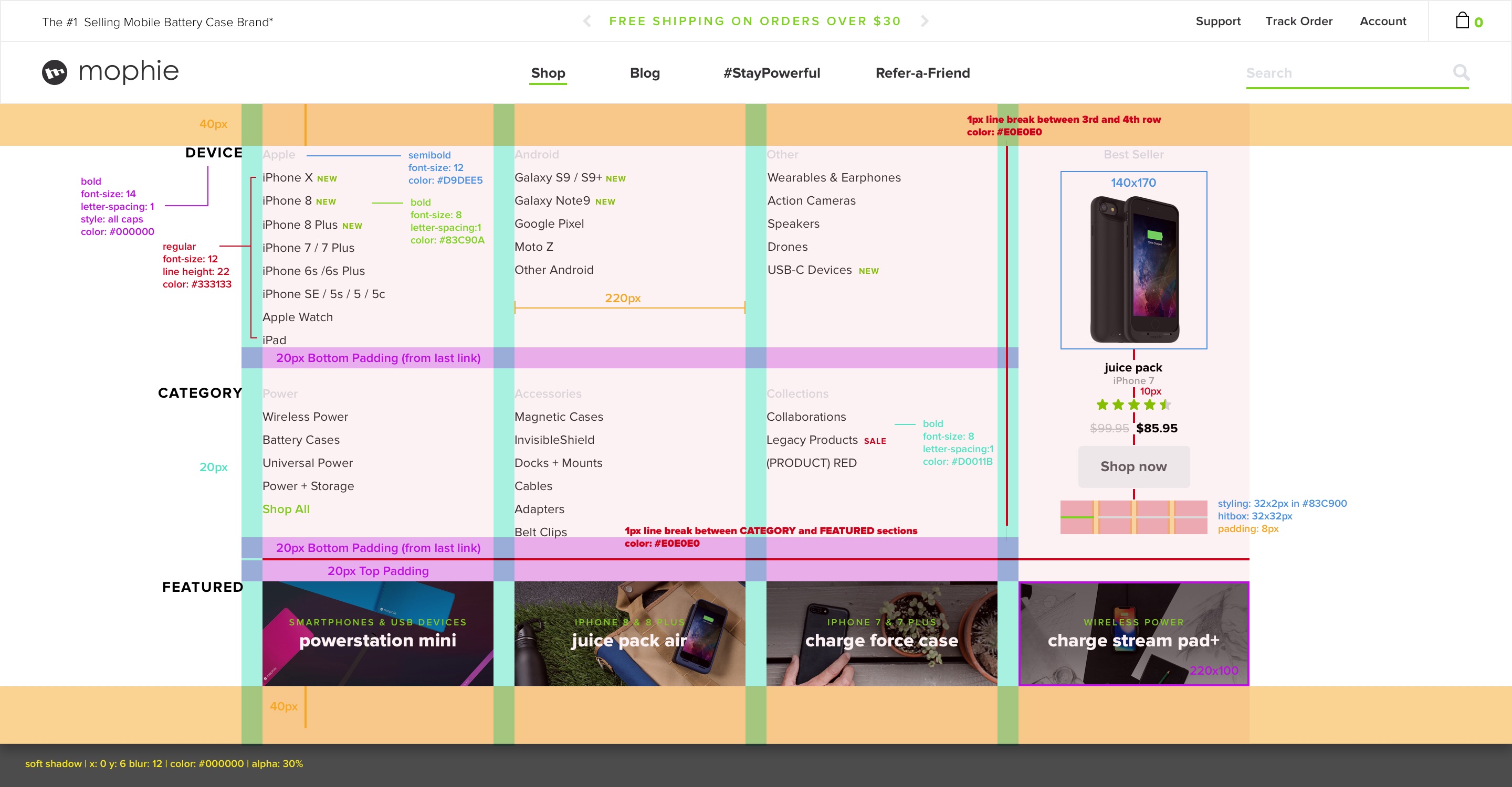
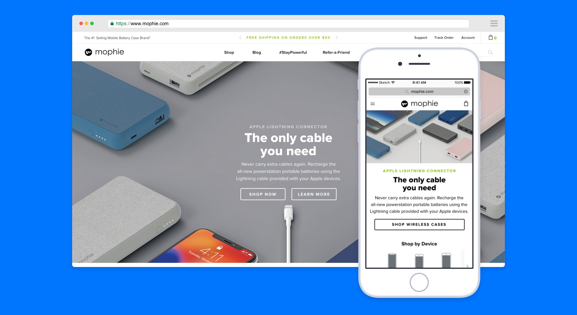
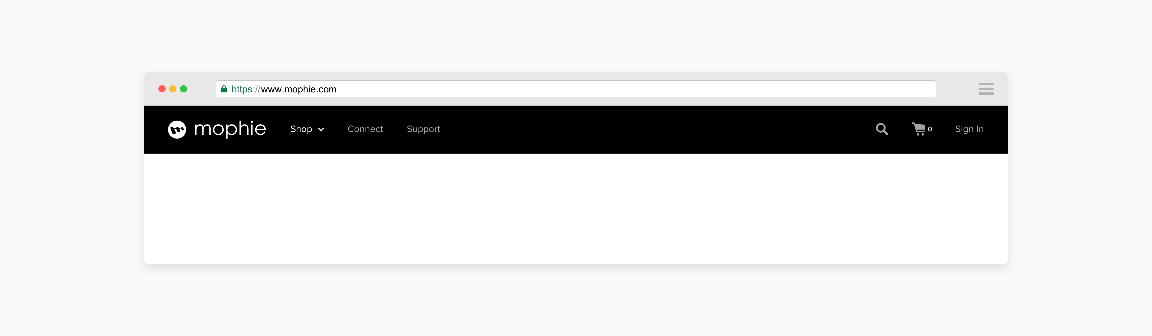
For the website navigation redesign, our team aimed to create a cohesive experience for desktop and mobile users but to also craft more thoughtful solutions for each different viewport size. Through user testing we crafted a user flow that most closely resembled what the average visitor does.
While the previous navigation system was working as intended, it wasn’t fully future-proof. It started to get harder to keep organized when the company began to greatly expand the product line up. We had to rethink how we categorized links to make it quicker and more efficient for the user to find what they need.
While the previous navigation system was working as intended, it wasn’t fully future-proof. It started to get harder to keep organized when the company began to greatly expand the product line up. We had to rethink how we categorized links to make it quicker and more efficient for the user to find what they need.


Rather than focusing on one or the other, I decided the best way to tackle the navigation was to develop the user flow of both desktop and mobile designs simultaneously. By comparing the needs of different users, it became easier to prioritize what navigation links needed to be most prominent and how to categorize each section.

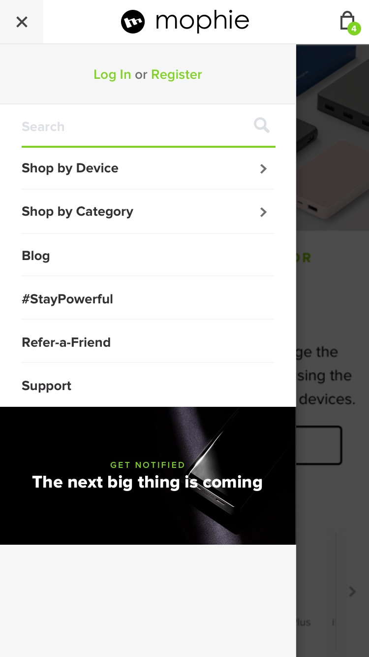
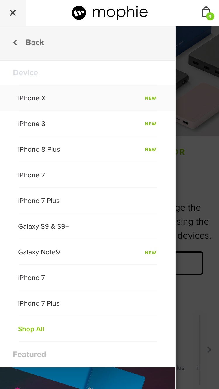
The biggest difference between the desktop and mobile experience mostly comes down to space. How do we create a mobile experience that mirrors the desktop experience and utilizes the space efficiently?
Our best solution was to carefully pick and choose what links went into the limited space of the mobile navigation. For the atypical user we provided a catch-all link in case they didn’t have a popular device or were unsure of what they were shopping for.
Our best solution was to carefully pick and choose what links went into the limited space of the mobile navigation. For the atypical user we provided a catch-all link in case they didn’t have a popular device or were unsure of what they were shopping for.